How to Build, Train and Deploy Your Own Recommender System – Part 2
We build a recommender system from the ground up with matrix factorization for implicit feedback systems. We then deploy the model to production in AWS.

While summary statistics (eg. sum, mean, stdev) are important concepts in the study of data science, they are not enough when you want to see a more complete understanding of your data.
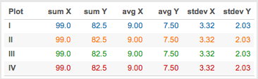
Take for example the summary statistics data in the table above. All the summary statistics indicate that all the data sets are identical. Or are they? You’ll see in the charts below, that could be further from the truth. They are all totally different, if not for the visualization with the charts, we will be none the wiser!
This is known as Anscombe’s Quartet, which was first constructed by the statistician Anscombe in 1973. He wanted to demonstrate the need to graphing the data before analyzing it, and the effect of outliers on these statistical properties.
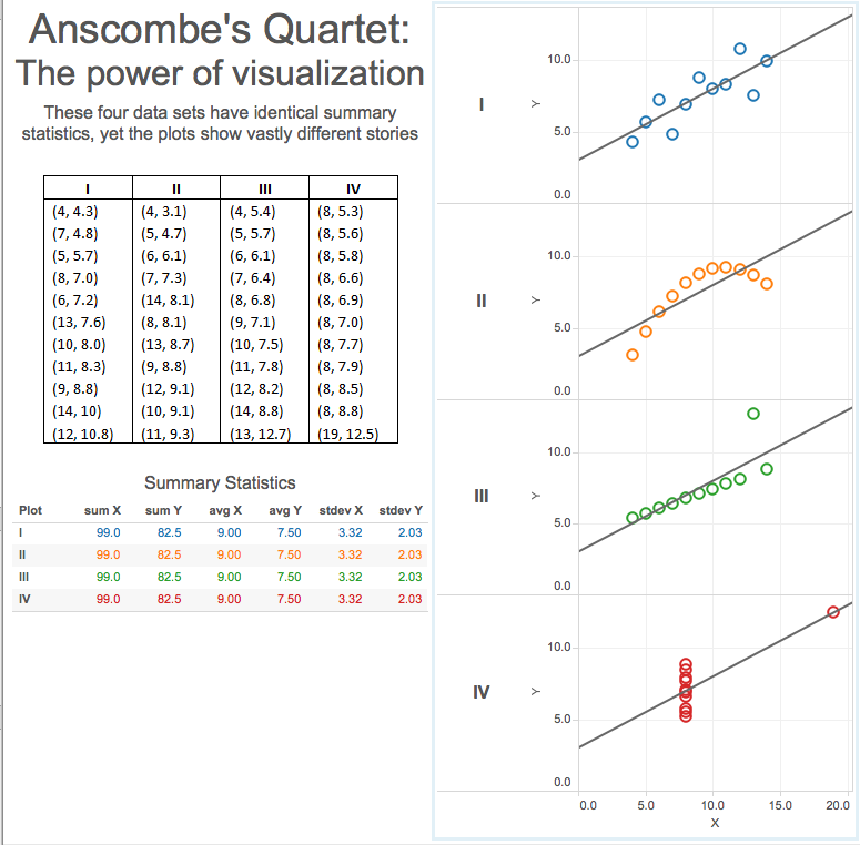
The above example highlights the shortcomings of summary statistics alone. It also shows the effects of outliers on these summary data. We are visual beings, and given the table above, it would not have given the impact and understanding that the charts would have easily conveyed.
In conjunction with exploratory data analysis and slicing and dicing your data, and in this case we use the most popular language and library for data scientists - Python and Pandas, we will also run the data through a series of visualizations. We like to see patterns at a high level, and evaluate early on if we can continue, because part of data science is ensuring we have enough data and if the quality of the data is good enough.
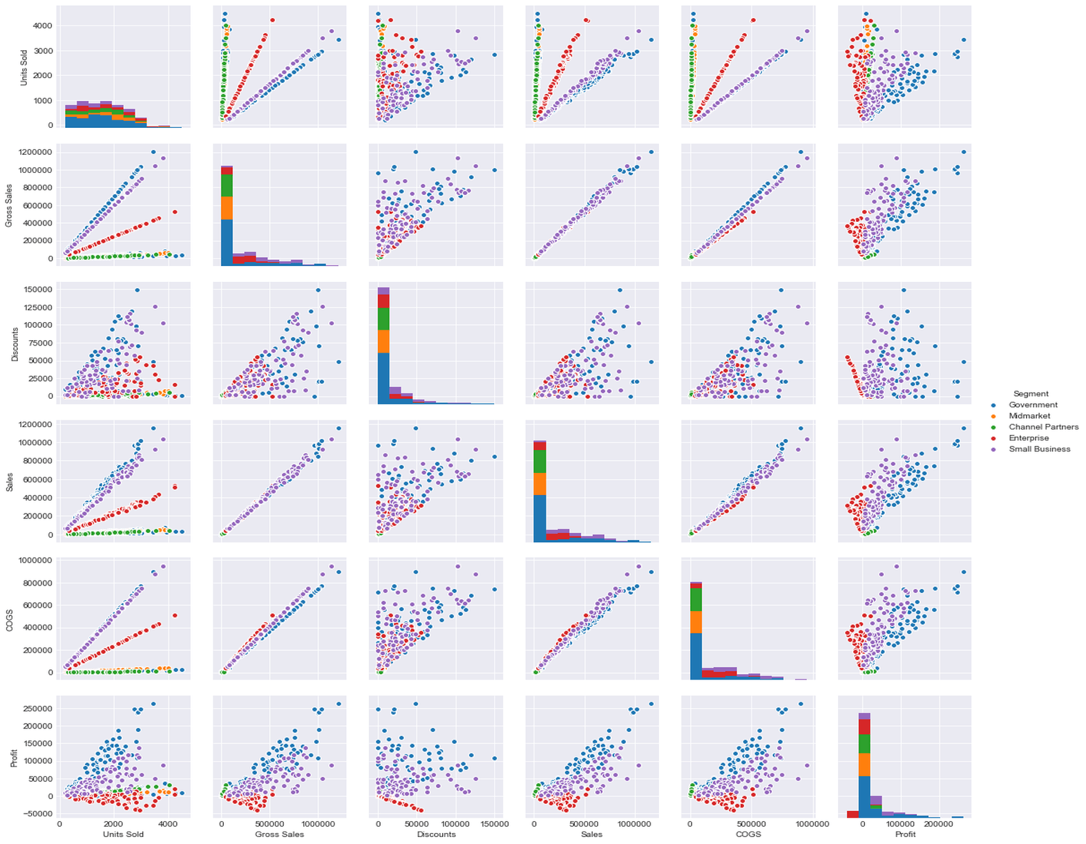
The charts above were generated by a popular python based library called Seaborn which is based on yet another python visualization library called matplotlib. Both these libraries enable the data scientist to easily create many different types of visualizations straight from their Jupyter notebooks.
When working with your visualization, specially in your Jupyter notebooks, the preference is to create many, and we were encouraged to plot as many charts as we can, the idea being these will be treated as throw away charts. These visualizations were created for the sole purpose of finding pattern at the early stages of the data science end-to-end process.
I still have the whole weekend to complete my Capstone project proposal, as well as the Unit 2 assignment. This will be a busy weekend. I will still be updating the proposal draft below, but I have decided that my project will be using the Formula 1 Racing dataset.
Ever since the first season of Drive to Survive, I’ve been captivated by the drama and excitement that is Formula 1. I’ve been consuming this public API in some of my past blog posts (DynamoDB and Single-Table Design, Simple GraphQL consumer with Apollo Client) and I thought it was fitting to continue this trend and explore the insights and predictions that can be gleaned from it:
We build a recommender system from the ground up with matrix factorization for implicit feedback systems. We then deploy the model to production in AWS.
We build a recommender system from the ground up with matrix factorization for implicit feedback systems. We put it all together with Metaflow and used Comet...
Building and maintaining a recommender system that is tuned to your business’ products or services can take great effort. The good news is that AWS can do th...
Provided in 6 weekly installments, we will cover current and relevant topics relating to ethics in data
Get your ML application to production quicker with Amazon Rekognition and AWS Amplify
(Re)Learning how to create conceptual models when building software
A scalable (and cost-effective) strategy to transition your Machine Learning project from prototype to production
An Approach to Effective and Scalable MLOps when you’re not a Giant like Google
Day 2 summary - AI/ML edition
Day 1 summary - AI/ML edition
What is Module Federation and why it’s perfect for building your Micro-frontend project
What you always wanted to know about Monorepos but were too afraid to ask
Using Github Actions as a practical (and Free*) MLOps Workflow tool for your Data Pipeline. This completes the Data Science Bootcamp Series
Final week of the General Assembly Data Science bootcamp, and the Capstone Project has been completed!
Fifth and Sixth week, and we are now working with Machine Learning algorithms and a Capstone Project update
Fourth week into the GA Data Science bootcamp, and we find out why we have to do data visualizations at all
On the third week of the GA Data Science bootcamp, we explore ideas for the Capstone Project
We explore Exploratory Data Analysis in Pandas and start thinking about the course Capstone Project
Follow along as I go through General Assembly’s 10-week Data Science Bootcamp
Updating Context will re-render context consumers, only in this example, it doesn’t
Static Site Generation, Server Side Render or Client Side Render, what’s the difference?
How to ace your Core Web Vitals without breaking the bank, hint, its FREE! With Netlify, Github and GatsbyJS.
Follow along as I implement DynamoDB Single-Table Design - find out the tools and methods I use to make the process easier, and finally the light-bulb moment...
Use DynamoDB as it was intended, now!
A GraphQL web client in ReactJS and Apollo
From source to cloud using Serverless and Github Actions
How GraphQL promotes thoughtful software development practices
Why you might not need external state management libraries anymore
My thoughts on the AWS Certified Developer - Associate Exam, is it worth the effort?
Running Lighthouse on this blog to identify opportunities for improvement
Use the power of influence to move people even without a title
Real world case studies on effects of improving website performance
Speeding up your site is easy if you know what to focus on. Follow along as I explore the performance optimization maze, and find 3 awesome tips inside (plus...
Tools for identifying performance gaps and formulating your performance budget
Why web performance matters and what that means to your bottom line
How to easily clear your Redis cache remotely from a Windows machine with Powershell
Trials with Docker and Umbraco for building a portable development environment, plus find 4 handy tips inside!
How to create a low cost, highly available CDN solution for your image handling needs in no time at all.
What is the BFF pattern and why you need it.